The challenge...
"...to determine users' pain points and needs when using the Netflix app and improve their experience when searching for shows or movies"
Netflix is a very appealing service primarily because it offers a variety of shows or movies that caters to a wide audience. However, it is because of that variety that users sometimes find it difficult to pinpoint and discover exactly what they want to watch. Searching for a show or movie may seem like a straight-forward task but due to several design and information architecture aspects of the Netflix app it is made complicated and at times downright frustrating.
I chose to redesign the Netflix mobile app as my capstone project for the Springboard UX design program. Over the course, I learned a lot about the UX process, the mindset required of a UX designer, and also gained new skills to utilize essential UX design tools.
Tool used: Survey Monkey, Draw.io, Balsamiq, InVision
Initial Research
1. Online Survey
I conducted an online survey using SurveyMonkey. I limited it to five simple questions to get as many answers as possible. In a couple of days, I was able to receive answers from 22 participants.
Goals:
The key takeaways from the survey:
Goals:
- Find out how users look for what they would like to watch
- Find out what hinders them in the search process
The key takeaways from the survey:
- The popular search methods were “Keyword Search” and “Category Search” but some people used “My List”.
- The majority of users felt that it is often times difficult to find a show/movie they want to watch.
- The majority of users found it difficult to find what they want to watch because there are not enough shows or movies available on Netflix.
- Users also felt that they got distracted easily when using the Netflix app.
- Users found that the categories on the top landing page were not very helpful.
2. Interview
Based on the results of the survey, I shortened the list of participants down to three users who use the app on a regular basis and who were willing to be interviewed.
Goals:
Goals:
- Dig deep into the process by which users discover shows and movies
- Try to discover users' frustrations or goals when using the app
The key takeaways from the survey:
- The simplicity of the app (one respondent)
- The customized categories such as “Continue watching” and “Because you watched...” (one respondent)
- The download icon is too small (one respondent)
- The screen is updated frequently and because of this the location of the buttons also change frequently (one respondent)
- Netflix doesn’t have specific shows or movies that they would like to watch (one respondent)
My full user research report can be found here.
- Everyone liked the download function because it allows them to watch shows or movies whenever they want.
- All of the respondents used the “Category Search” (film strips) on the top page when they were not sure what they would like to watch.
- What users liked about the app:
- The simplicity of the app (one respondent)
- The customized categories such as “Continue watching” and “Because you watched...” (one respondent)
- Users got frustrated because:
- The download icon is too small (one respondent)
- The screen is updated frequently and because of this the location of the buttons also change frequently (one respondent)
- Netflix doesn’t have specific shows or movies that they would like to watch (one respondent)
- Additional notes: One respondent stated that the ratings, such as TV-PG and PG-13, are very helpful when choosing a show or movie for kids. However, they suggested that a more detailed explanation of the ratings such as “Contains violence” or “Contains adults language” would be great.
My full user research report can be found here.
Heuristic Analysis
I chose three competitors of Netflix: Amazon Prime Video, Hulu, and Sling TV. I then conducted heuristic analysis for each service. I selected five principles of Nielsen Norman Group's ten heuristic principles that were most relevant to the goals of this redesign and applied them as the viewpoints of the analysis.
The five principles I chose were:
Goals:
What I learned from each competitor:
The five principles I chose were:
- User control and freedom
- Consistency and standards
- Recognition rather than recall
- Flexibility of efficiency of use
- Aesthetic and minimalist design
Goals:
- Determine what Netflix can learn from its competitors
- Understand what the competitors strengths and weaknesses are
What I learned from each competitor:
- Amazon Prime Video: It did well overall when I looked at it from the viewpoints of the above five usability heuristics. The organization of categories and the overall navigation was easy to use and intuitive. It also had an efficient way of discovering shows or movies by simply expanding the category rather than scrolling all the way to right. One thing it could improve on is to simplify the overall layout of the screen. The screen, while well organized, was overcrowded and at times overwhelmed the senses.
- Hulu: It had a sleek minimalist design throughout the app and the density of content was much easier on the eyes as compared to the other competitors. However, the cover art of shows or movies took up the majority of screen real estate on most pages, making it difficult and inefficient at times when quickly searching for content. It also did not have a download or previously viewed option, which could be considered negative aspects for the users.
- Sling TV: This app could use the most improvement overall among the three competitors. The way that they display the shows was inconsistent throughout the app and it did not look organized. The text size was also too small to read in some areas. Compared to the other two competitors, it took more time for me to figure out how to user the app.
Empathy Map & Persona
To visualize who the users are as well as their pain points and goals, I created an empathy map and persona using the data from the online survey and interviews. The persona helped me clarify who my target audience is and it allowed me to keep focused on my goals for the redesign.
User stories
In the next step, I developed user stories for each key feature of the app. Based on the research data and the persona I created, I determined the following to be the key features:
Goals:
The user stories which helped me the most in the design process:
- Browse
- Search
- Download
Goals:
- Capture a description of the above features from users' perspectives
- Focus on users' requirements first before jumping into the details of the design
The user stories which helped me the most in the design process:
My full user stories can be found here.
Content Strategy
1. Card Sort
According to my previous research, users tended to browse shows or movies using the categories on the landing page but they found it confusing at times. This was understandable because there were dozens of categories and most of them seemed unnecessary or too specific.
I recruited six users of the Netflix mobile app. I conducted a hybrid card sort in person with one participant and used the card sorting software Optimalsort for the other five participants. I picked 25 shows or movies in the Netflix mobile app, wrote them down on cards, and asked the participants to organize them into three categories (“Comedies”, “Cooking shows”, and “Dramas”). If any of the cards did not fit under the three categories, participants were allowed to create their own categories and write them down on new cards.
Goals:
- Find out which categories aren't familiar to individual users
- Verify the categories that are universally understood
Results:
- The participants sorted the most cards consistently into “Comedies” and “Cooking shows”.
- “Drama” had the widest variety of the cards.
- “Animation”, “Animated”, “Kids and Family”, “Family”, “Sci-Fi”, and “Suspense” were common categories created by participants.
- Participant-centric analysis suggested that the most preferred groupings were “Comedies”, “Musical”, “Animation”, Cooking shows”, “Drama”, “Adventure” and “Suspense”.
2. Sitemap
Based on the results of the card sort and the data from user research, I then created a sitemap which also included my ideas for the redesign.
Goals:
Goals:
- Visualize the information architecture of the content in the app
- Ensure that the content is placed where the user would expect to find it
- Determine an information architecture that is well-suited for users based on the findings of the research
Thought process of redesign:
|
3. User Flows
In order to address users' needs, I wrote the following three objectives based on the previous user research and the persona.
Goal:
Additional Notes: The red parts below show the flows that I redesigned.
- Find a show or movie available for download
- Find a show or movie for a 5 year-old child and confirm if it is appropriate for the age
- Find a Netflix original show or movie based on the user's history and preferences
Goal:
- Visualize the path that users take to accomplish their goals
Additional Notes: The red parts below show the flows that I redesigned.
Sketching & Wireframing
I made sketches using a paper and a pencil based on the user stories I created earlier. After iterating through sketches I moved on to creating wireframes using Balsamiq.
The below slideshow displays the wireframes for the three user flows (User flow 3 has two different ways of accomplishing the task) and the last document explains how I reflected the user research into the design.
Examples of my sketches
Redesign Decisions
Prototyping
After iterating over the wireframes in Balsamiq, I made a clickable prototype using InVison. It was the first time for me to use InVision and creating a prototype was much harder than just putting wireframes together. Though I had to take some time to create a prototype what I learned was very rewarding.
My full story of creating the prototype can be found here. The prototype itself can also be found here.
Visual Design
I learned the basics of visual design including how to use color, typography, images, and shapes and then applied concepts in creating a style guide for my project.
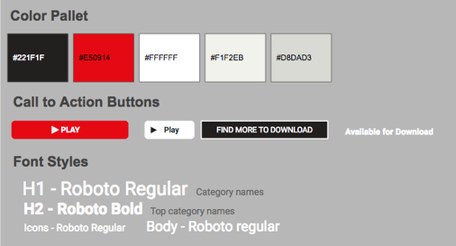
In my style guide, I have kept the two primary colors of the current Netflix app: #221F1F and #E50914. The font color will remain white (#FFFFFF). In addition to this, I added two other primary colors to the pallet which are #F1F2EB and #D8DAD3. The two colors will be used for the font depending on the background or their placement.
I chose Roboto as the font type because it is easy to read even in small font sizes and the style is relatively neutral which will prevent the user from getting distracted from the content. |
Usability Testing
After completing the prototype in InVision, I proceeded to do usability testing. I decided to test the following three tasks:
Goals:
Key takeaways:
It would be interesting to do further testing in regards to the placement of categories at the top ("Home", "Netflix Original" and "Kids and Family"). I am also curious if testing with a high fidelity prototype would change the results.
With the above information I would like to focus on the following points in future iterations:
- Find a show or movie available for download and go to the description page
- Find a show or movie for a 5-year-old child and check the parent reviews
- Go to the "My List" page
Goals:
- Observe what the users do and how they react while using the prototype to validate its usability
- Discover any problems the users may have with the prototype and solve them for further improvement
Key takeaways:
- Everyone could complete the tasks without major obstacles. The new locations for "available for download" and "My List" were found easily by all of the participants.
- The "See More" button that I redesigned was recognizable by the participant.
- Two participants told me that the parents’ review section looked nice and they also liked the “Verified by parents” part.
- Two participants looked at the categories above the show or movie images first and did not notice the categories at the top for a few seconds. This may be because the current version does not have the top categories but that was something I did not expect. It made me think more about the placement of those categories.
- One of the participants commented that the location of “Kids & Family” was strange and they were not sure that it was where they would look to find a movie for a 5-year-old.
It would be interesting to do further testing in regards to the placement of categories at the top ("Home", "Netflix Original" and "Kids and Family"). I am also curious if testing with a high fidelity prototype would change the results.
With the above information I would like to focus on the following points in future iterations:
- The placement of categories
- The connection between "Kids and Family" and "For ages 5 to 7"
Final thoughts
While the Netflix app is a rather well designed app, my research revealed that there are some usability issues that prevent users from getting the most out of the Netflix service. With a few changes related to information architecture, some visual design tweaks, and a bit of re-organizing, the Netflix app could provide a more flexible interface with easily discoverable content.